

Town of Fayetteville Municipal Branding
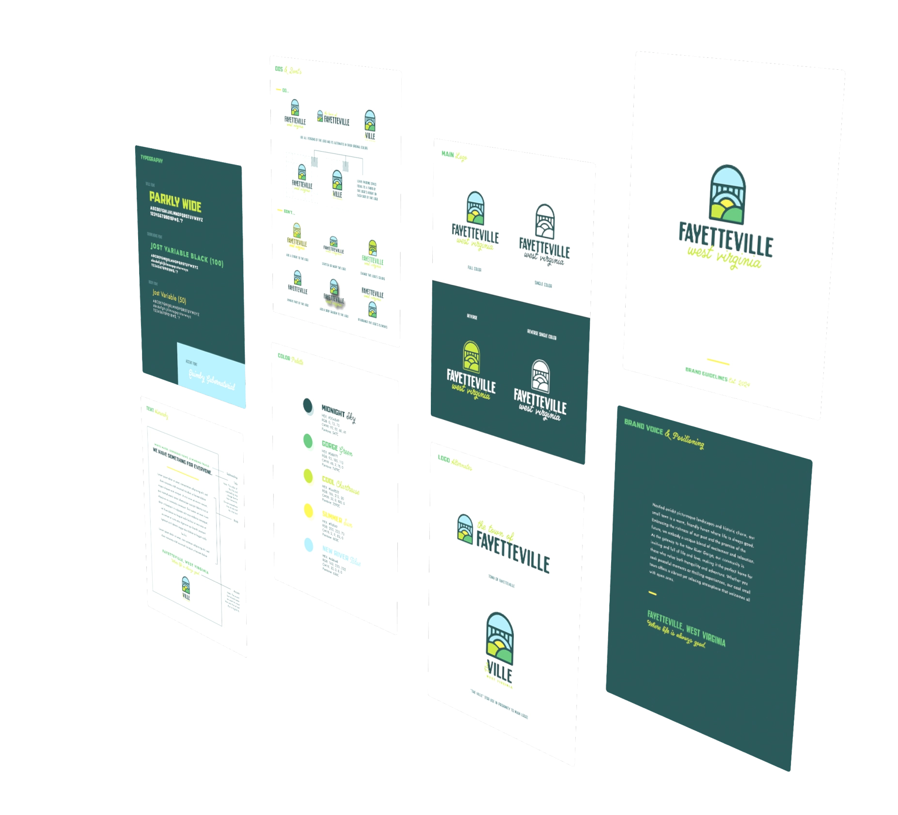
Fayetteville’s visual identity hadn’t evolved to reflect its transformation into a thriving tourism destination and vibrant community hub. The town needed to authentically represent its dual appeal — adventure and relaxation, history and progress — while serving residents and visitors. DR designed a logo and brand strategy resonating with multiple audiences without compromising community identity.
The Goal
The vision was clear: create a visual identity that feels authentically Fayetteville — warm and welcoming — while positioning the town as a compelling destination for both locals and visitors.
The Strategy
Research revealed Fayetteville meant different things to different audiences. A dual-brand framework honored both communities: a primary identity embodying warmth and community pride, with a complementary expression communicating discovery and cultural richness.
The Results
The logo and brand identity achieved immediate and comprehensive adoption across town infrastructure. Municipal departments integrated the new identity into directional signage, gateway markers, visitor kiosks and digital platforms, successfully differentiating Fayetteville as an authentic destination brand in the competitive regional market.
-
100%
municipal-wide brand adoption -
7
unique icons created for wayfinding signage -
2
audience-specific complimentary logo designs