
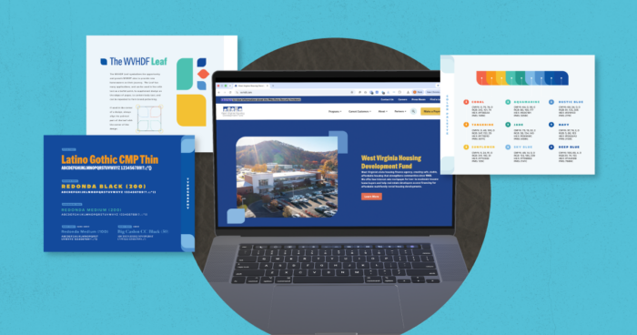
In 2025, DR was tasked with an exciting opportunity — a brand revamp for a pillar of West Virginia’s community, the West Virginia Housing Development Fund (WVHDF). Their mission to bring affordable housing to all West Virginians is incredibly important, and so we set out to create a stunning brand to match.
Building the Brand
Brand Attributes
WVHDF’s brand attributes permeate the overall feel of all of their marketing materials, whether it is a video, copy, print design or digital visuals. To best represent their mission and goals, we narrowed it down to four key words: informative, supportive, approachable and hopeful.
Color Palette
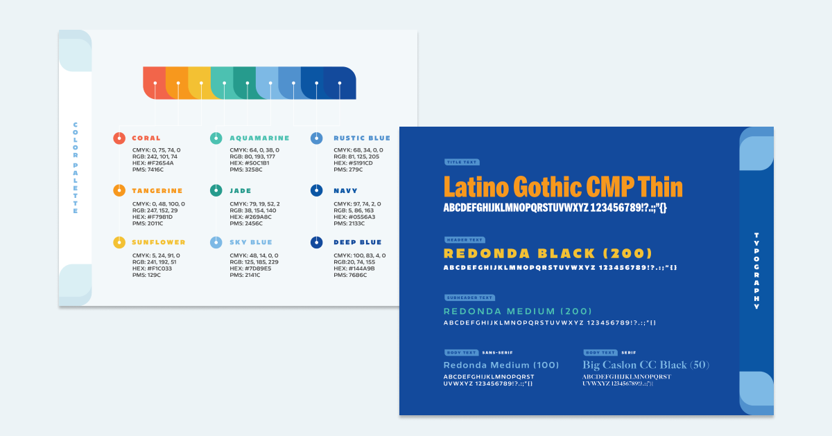
When we started work on the WVHDF brand revamp, we were really only working with two major colors: a navy blue and an aqua green. The new palette was built directly around those two colors, focusing on maintaining recognizability, while also bringing a new, innovative look to the brand that matched the caliber of its real-world output.
The brand colors — Coral, Tangerine, Sunflower, Aquamarine, Jade, Sky Blue, Rustic Blue, Navy and Deep Blue — provide a full-gamut range of vibrant colors that complement the existing brand. With a diverse yet finely tuned palette, we were able to create a clean, unified look while also providing plenty of options for the new original illustrations, which are a central part of the revamped identity.

Custom Original Illustrations
WVHDF’s new illustration library is where the brand really shines. Original illustrations were created with a few things in mind — intentionality, simplicity and representation.
The illustrations are all original vector drawings with intentionally placed details and accents. Not too much, not too little, but just the right amount of linework, clothing accessories and shading to create dimensionality and personality in the characters and environments. They were also created with the end goal of creating long-form animations — so each character can be rigged, posed and animated with ease.
The flat, simple vector illustration style allows these pieces to fall in line with the rest of the brand assets seamlessly. The images can easily be used by anyone in any program for social media, printed pieces, presentations and more — so once an illustration is complete, its applications are limitless.
Representation was at the forefront of the illustration process for WVHDF. We set out to show a variety of living situations that applicants might identify with — the nuclear family, single applicants, couples and single parents with children (and even some pets!) — so that anyone who might be looking to make their homeownership dream a reality sees themselves depicted in WVHDF’s materials.
The best part? If WVHDF needs a different illustration for a new loan, project, profession or potential customer, we can create it 100% on-brand — because we created the style! That’s the beauty of original illustration.
The WVHDF Leaf
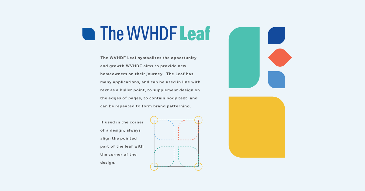
The primary motif of the revamped WVHDF brand is the Leaf design element. It symbolizes the opportunity and growth WVHDF aims to provide new homeowners on their journey. The Leaf has many applications, and can be used in line with text as a bullet point, to supplement design on the edges of pages, to contain body text and can be repeated to form brand patterning. On the website, it is used with a dynamic scroll effect to section information on each page.
Typography
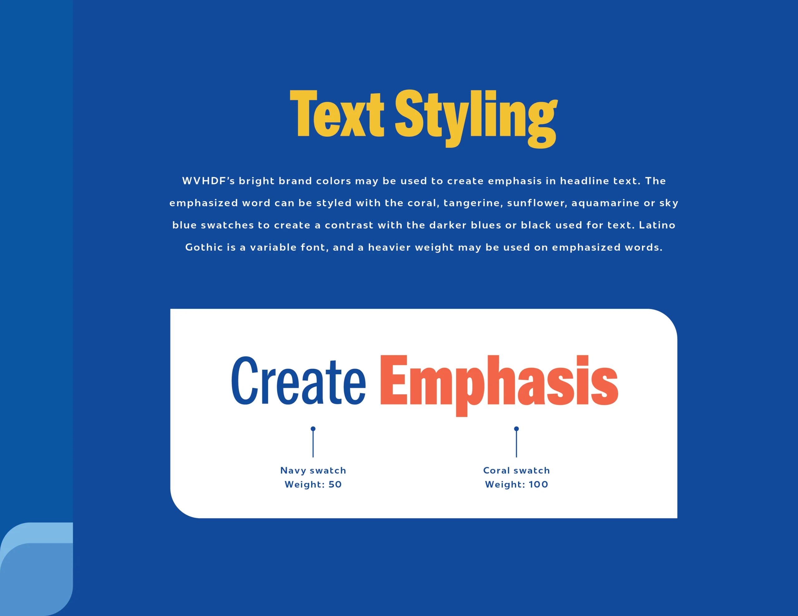
We updated WVHDF’s typescale to go hand in hand with the more modern, bold, vibrant approach of their new direction. For the title font, we chose Latino Gothic, a sans-serif, compressed variable font that is easily legible in a wide array of applications and colors. The font’s weight can be easily adjusted with a slider to create emphasis and highlight important words or phrases in a headline. Using a bold, legible font allows us to capture the attention of the audience easily, so no one has to do extra work to understand the information being communicated.
For the header, subheader and body text, we selected another sans-serif variable font called Redonda. It is used in all caps and bold as a header, and in its medium weight for subheadings and body text. While both the primary header and subheading are sans-serif, their vast X-height differences and varied kerning add to the brand’s ultra-legible, clean, innovative look.
Building the Site
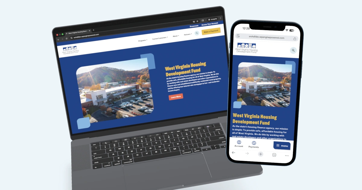
After the brand was fine-tuned, the WVHDF website began to take shape. The site was designed with accessibility at the forefront. All fonts, graphics and color pairings were handled with care, so that everyone can easily find the resources they need to start searching for their new home.
Color Palette
To create an accessible color palette for this website, we ensured that color contrast minimums were met, meticulously graded all potential color pairings and tested them independently for the different types of color blindness using an emulator tool. By doing this, we were able to ensure that all site elements would be clearly visible to all users, regardless of their perception of color.
We crafted an explicit set of rules stating which colors and pairings could be used for specific site components, and which ones would not be available to use when building or editing specific pages. All pages of the site will easily remain accessible and pleasing to look at, regardless of when they are created.
Accent Pairings
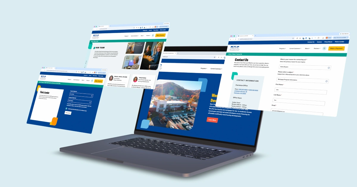
For sitewide consistency, we established accent color pairing rules. With the background and accent rules in place, we expanded the rules to include the availability of different card types and illustrative accents. Then, we determined that accent pairings would only repeat on a page if there were five or more sections, ensuring that each page has visual variety, but retains a cohesive brand.
Typography
The brand type styles were translated directly into an accessible type scale. For page titles and section headings, we used Latino Gothic. For the remaining headings, subheadings, body type and labels, we used Redonda Condensed. To ensure the type displays cleanly across the site, we incorporated spacing rules directly into the type styles.
Launch
The WVHDF brand revamp and website launch provide an exciting new creative direction for the brand that encompasses its important mission, and spreads the word to all West Virginians that their new home is just within reach.
Click here to check out all of the great work WVHDF is doing across the state.