

QR Codes That Suck And How To Fix Them: Part 2 [2021]
Published: March 20, 2012Updated May 2021
If you were working in marketing in 2011, there is a solid chance that you saw, or even made, a QR code. Odds aren’t great that you actually used one but back then, they were the new hotness in digital marketing.
Looking back on it, the early days of QR code usage are very similar to the early days of the web. People working in technology saw a tool originally intended for something entirely different (remember hand-coding HTML emails?) with no real standards and proprietary knockoffs saw an opportunity. Just like HTML email, and even SMS, QR codes are essentially tools for content delivery. The scanning was never the end goal, but where the scan sent users.
And that was the problem.
Unlike SMS, which has shipped on every mobile phone for over 20 years, QR code scanning wasn’t included on the virtually any smartphones until recently. Starting with iOS 11, released in 2017, it’s possible to scan a QR code with an iPhone without having to install any additional software. In a similar vein, starting with Android 9, it’s possible to scan a QR code with Android without installing additional software.
Bundling QR code scanners with mobile operating systems has removed the single largest barrier that QR code adoption ever faced: having to install an app to scan them. Now, it’s has as easy as pointing your camera at a QR code.
Also bolstering QR code adoption is the changing landscape of the web. 2011 was the very early days of responsive web development, with most developers still shipping separate websites for mobile users. Since then, the “mobile” web has usurped the “desktop” web to simply become the web. More users are on mobile than ever and it’s growing every year.
It’s easy to see why QR codes are starting to pick back up. Especially in a post-COVID world where contactless interactions are more important than ever. Retail use of QR codes is exploding thanks to consumer expectations that they be able to get the content they need without touching anything or interacting with anyone. We’re using them in Digital Relativity projects too, allowing us to augment print pieces like travel guides and brochures with digital content that can be updated months or even years after the original piece has been printed.
Are QR codes easier to scan than ever? You bet they are.
Are we sending users to experiences optimized for their devices? More than ever.
There has never been a better time for your marketing agency to be rolling out QR codes are part of your marketing strategy.
Want to use QR codes in your next campaign? Get in touch and let’s build something cool!
Original post from March 20, 2012
QR Codes That Suck And How To Fix Them: Part 2
Hello, once again ladies and gents, and welcome to the second installment in our series…
QR Codes That Suck and How to Fix Them.
The last time we met, we examined the lackluster shortcomings of Wired magazine. In keeping with this theme, we will be examining issues of The New Brewer (Jan/Feb 2012), DRAFT magazine (Jan/Feb 2012) and Vegetarian Times (Oct 2011) as well as a tip-top secret surprise participant at the end.
For those who missed our first installment, this purpose of this series is to find poorly implemented QR code campaigns and illustrate how they could be improved to better serve the companies using them.
Without further adieu…
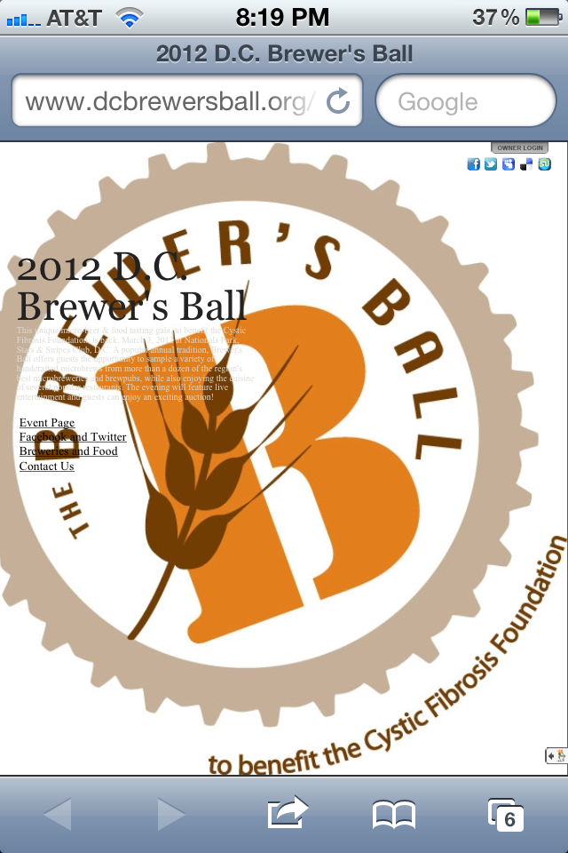
The Brewer’s Ball
What’s better than a QR code floating in water? A QR code floating in beer, of course! That being said, maybe my hopes for this code are a little high. Let’s see what we get.
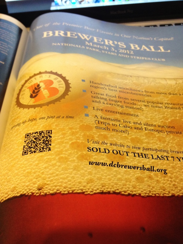
Maybe our expectations were too high. Maybe seeing a QR code floating in beer skewed our judgement. We had high hopes, but this landing page is pure disappointment. Not only is it not mobile-optimized, but it is the opposite. Difficult to read, even more difficult to navigate. It is not immediately evident what the website is, and it is even less evident what the user is supposed to do.
How They Can Fix It
- A shortened URL would have not only improved scanability, but also would have helped provide some more robust tracking information.
- There is no call to action in the ad. How is anyone supposed to know that they should scan the code? You have to give them a reason!
Green Festival
Switching gears, let’s check out a non-beer QR code. This one is from the Vegetarian Times, and the ad is for the Green Festival. The first thing we notice is the lack of a call to action. Just a QR code floating there, suspended in the middle of the page, with no label or title or anything. And the landing page is just as bad.

When the gargantuan beast that is this web pages finally loads, the user will be immediately blown away by the sheer vastness of the completely undesirable information. Tiny text, more links than I can count on my fingers and toes, and some pictures that don’t really tell me much about what I’m doing there.

How They Can Fix It
- Just like our first contestant, the Green Festival QR code lacks any kind of URL shortening. Could be used to improve not only scanability, but analytics as well.
- In what appears to be a recurring pattern, this QR code also lacked any kind of call to action. What am I supposed to do?!
- Clearly not mobile optimized. Barely desktop optimized. Just generally bad.
Simply Organic
This one got me excited. I mean, I love me some pizza, and this QR code has a call to action that tells me flat out: scan for a pizza recipe. I don’t personally like to cook, but it’s hard to tell what I’ll do when pizza is a possible result.

No pizza. No nothing. A page with literally nothing on it. Just a 404. The only more empty and hollow than this page is my stomach after being teased with delicious pizza. Shame on you, Simply Organic.

How They Can Fix It
- Do I really even need to tell you? Yeah. No URL shortening. Again.
- Make it go to a page that is…you know…a page. With stuff on it… that I can read.
- I guess it’s safe to say that this page isn’t mobile optimized. Or optimized at all. For any device.
Hop Union
Maybe we’re becoming spoiled after that last one but damn it, there’s a call to action right there. We’re being given instructions with a clear indication of what the reward will be. Is this too good to be true?

Yes. This landing page is not only a desktop site, but it isn’t even their news page. It’s just their homepage, in all of it’s hoppy and indiscernible glory.

How They Can Fix It
- You guessed it. No shortening.
- The call to action is a lie. Don’t defend them. It’s a lie. A bold-faced lie. There are no events to be seen on this page.
- It wouldn’t have matter much if this WAS the events page, because you can’t read it anyway. Is making a mobile landing page THAT hard?
Wild Goose Canning
In the far off corner of this full-page ad, we see it. Pearly white against the black landscape, it stands. Alone. Solitary. Defiant. Confusing. Unlabeled. Stupid. Let’s follow this black hole and see where we end up.

Wow. The only thing with more vast amounts of black than that ad is the landing page. Luckily, there is a spinner in the middle to let us know that someday, there will be something there. Maybe a picture. Maybe a cat video. Maybe the cure for some terrible disease. Doesn’t matter. We’ll never see it.

How They Can Fix It
- I feel like I’m just saying this to hear my own voice. Shorten. Your. URLs.
- In case you didn’t notice, that QR code was a third of a page away from any words. It was even further away from a call to action. Because there wasn’t one.
- That landing page? That big, black, steaming pile? It sucks. It’s wrong. It’s bad and they should feel bad.
Photodegradable Rings
It’s better to be safe than sorry, and that’s the stance the designer of this QR code took. He (or she) wrapped this is entire QR code in a good half inch of just white. Like a warm blanket, to protect it from the harsh elements of nature that inhabit the rest of the ad.

The suckage level here is pretty standard, run-of-the-mill suckatude. Nothing special. Just an unshortened URL that takes you to a shitty landing page. Nothing to see here. Move along.

How They Can Fix It
- Short. The opposite of long. Make your URL that.
- Your phone is not the size of your computer (unless you have one of those hideous, stupidly massive Samsung Notes, but that’s your own fault) and your landing page should allow for that.
Beer Brand
Beer? And branding? Like, combined? As a service? You have my attention. Oh, and you have a QR Code too. This must be awesome.

The only thing more terrifying than that creepy cartoon man’s beard is the fact that someone, somewhere thought this was a good idea.

How They Can Fix It
- I’m not even going to tell you. You should know.
- You might not know it, but some people don’t know what QR codes are (*GASP*). You need to tell those people what to do.
- This landing page is just…awful. Like, so awful it’s cool how awful it is. No, it’s not. That’s a lie. It’s just awful. Not mobile-optimized. Not immediate use or information. Just a scary-ass beard man.
PakTech
This QR code almost snuck past us. They’ve pushed it as far into the corner as they can, but we found it. When you’re that far from anything, no one can expect you to have a label or anything. That would kill the mystery.
But, look closely. They have their logo in the QR code. What does that tell us? Someone put some time into this. Sure, it was probably about 10 minutes and they were probably watching House or something while they did it, but they did it. They actually opened Illustrator and touch the QR code.

The designer goodness stops there. After learning that this strange symbol is actually a scannable barcode, we scan it and we are greeted with…redirects. All over the place. I actually felt myself getting jet lag from all the redirects. Not like it matters. Sent us straight to a desktop site anyway. Glad to see those 15 URLs were put to good use.

How They Can Fix It
- In the typical fashion, this code is lacking anything that could be considered a call-to-action. Not even a label.
- Those redirects were kind of off-putting. Maybe that’s the way analytics worked in the mid 1990’s. I wouldn’t know. I was too busy being Darth Vader in my grandma’s yard. But, the fact remains: these are a waste of time and resources.
- Tiny text. Huge images. Smells like a desktop site to me.
McDantim
Not only does this code have a call to action, but it looks like it actually goes to a web app. This could be big…

Disappointment. This site looks older than me, and I’m 20. That’s almost older than the internet, and that’s sad. But…what’s that. A link…THEY HAVE A MOBILE SITE! A NICE ONE! With custom web apps and everything. They just chose to send us to the desktop site instead…What the…I don’t even…

How They Can Fix It
- This URL is straight up massive. Like, it could be measured in lines. Mobile or desktop doesn’t matter. This is just way too long.
- Them sending the user to a desktop site is bad. But, sending them to this awful desktop site when you have a pretty awesome mobile site is just stupid.
Gamestop
I love video games. I have a GameStop Pro Reward account. I get an issue of Game Informer in the mail every month. This code spoke to me. It told me about all of the awesome things it could show me. It even came out and said ‘You have to see it to believe it, scan this code.’ It was so awesome that they couldn’t even summarize it in a way that was believable.

And they were right. I don’t believe it. I don’t believe that any human being could possibly think this campaign was executed properly. Not only did I get sent to the GameStop desktop site, but I got sent to a desktop page with nothing but a massive picture. Totally useless, totally disappointing.

How They Can Fix It
- I bet you can’t guess what was wrong with this URL.
- I’m on a mobile device. Show me something optimized for it. Like your mobile site.
- There was nothing unbelievable about this. That call to action lied to me, and now I’m disappointed.
Well folks, that’s it for this installment of QR Codes That Suck. As you can see, we have no shortage of terrible QR codes and agencies around the country are fueling the fire every day.
When was the last time you saw a QR code that sucked?