The Simple ‘ABC’ Trick to Retaining Your Blog Readers
Published: November 21, 2013So I’ve been researching little things to make my sentence structures more beautiful, and I’m not meaning more adjectives and adverbs. I’m meaning visually. There is scattered information on what TO DO and what NOT TO DO, but the information can be very vague and confusing.
So I am going to be writing a series of blogs on simple ways to make your blog look cleaner and more respectful. With these little changes, viewers will be able to read through your blog with less reading fatigue, which means they will actually keep reading.
What kills a reader’s enthusiasm to read
more than 70% of the time?
This treacherous and overly common demon is: line lengths! Line lengths are how long a single line is. It’s usually counted by the number of characters.
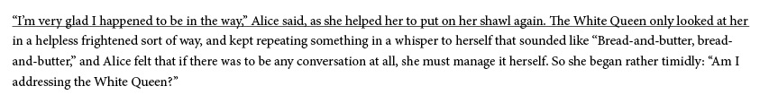
So in the image above, I underlined what I’m calling a line length (So we visualists will understand). If you wanted to count the characters (or just trust me,) there are 106. For anything: print, web, birthday cards, tombstones, whatever, that is way to many characters in a single line!
Line lengths are like the porridge from the Goldilocks story. To long, the reader will get fatigued of reading the same line and lose their place in a jungle of sentences. Too short, the reader will get frustrated because the natural flow of reading is broken up by 3- or 4-word sentences. But make a line length just right, they will read further into your blog without distraction.
So how do I know the right Line Length,
Mr. Blogger man?
The answer is: more than 45 characters, but less than 90. The goal is to aim for about 70 characters.
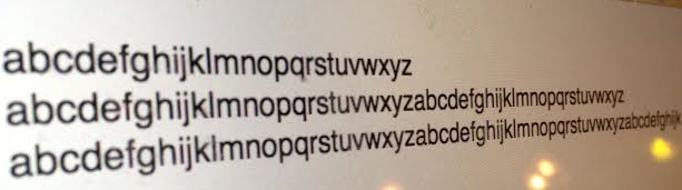
But, honestly, you’re not going to count each character. I’ve created a quicker way to check line length. What I have adapted and find very useful is the 2.5 alphabet rule. Yes, I said two-and-one-half alphabet.
Stop counting. There’s a quicker way.
Use The 2.5 Alphabet Trick
So you go into your horrendous blog and type ‘abcdefghijklmnopqrstuvwxyz’ twice, but on the third time stop at the k. (I’m not going to do it here, but you’re welcome to copy and paste my alphabet above if you can’t type your alphabet for some odd reason.)
When testing this out, make sure you’re using the point size you have chosen for your blog in whatever crappy Google font you’re using (I’ll explain my Google font aversion another time)
This will give you a great line length. Because it truly comes down to what type your using, the tracking, line heights, and character spacing. For example, if I’m using 17pt Ariel on my blogs, by measuring it with pixels, I know it comes to 520 px. I would be able to set my column with appropriately and adjust the line length.
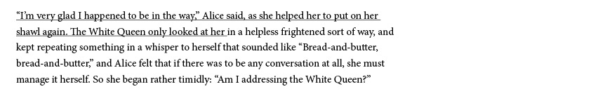
So, going back to the previous image I used, and by using this multi-alphabet rule we can see what would happen:
By giving yourself a measuring tool, you can make a blog more comfortable for the reader and reading fatigue wont kick in, causing them to abandon ship before they get to the good stuff.
I hope this helps you bloggers that just want a chance out there. Just remember the 2.5 alphabet rule when creating your blog. If this article at all helps, please link me to your blog so I can see what you’ve done!
Next topic – Line height.
Does your blog use the right number of characters in its line lengths?