Why You Only Need One Mobile Site
Published: July 27, 2012When the mobile web was born, it was anything but user-friendly. Different companies were implementing different ways to access information. There was a rush to become the thought leader and publish a standard that everyone else would follow.
Unfortunately, no one stood out. All of the solutions were rather cumbersome. They required website owners to specifically cater to each of these standards so that they could provide content to those who were locked into that standard. This was a lax situation, with the burden put on site owners to try and keep up with the changing landscape of the mobile web. Not to mention that the user experience that was provided was pretty lackluster.
Smart Phones Change the Game
Fast forward to the smart phone. By 2014, mobile internet is predicted to take over desktop internet usage. 55% of current mobile owners access mobile web. In fact, the smartphone has become the only screen for many users. Smartphones are so powerful now that most users find that it meets all of their internet needs. There’s no reason for them to pay for a home internet line and keep a computer around.
And so even though these smartphones are extremely powerful, that doesn’t mean you should force a mobile user into a full desktop experience on a small mobile screen.
The mobile web deserves a different experience.
User-Friendly Development
Mobile web users are often using your site in a different way than a desktop user. You don’t want to make them hunt for the content that they are looking for.
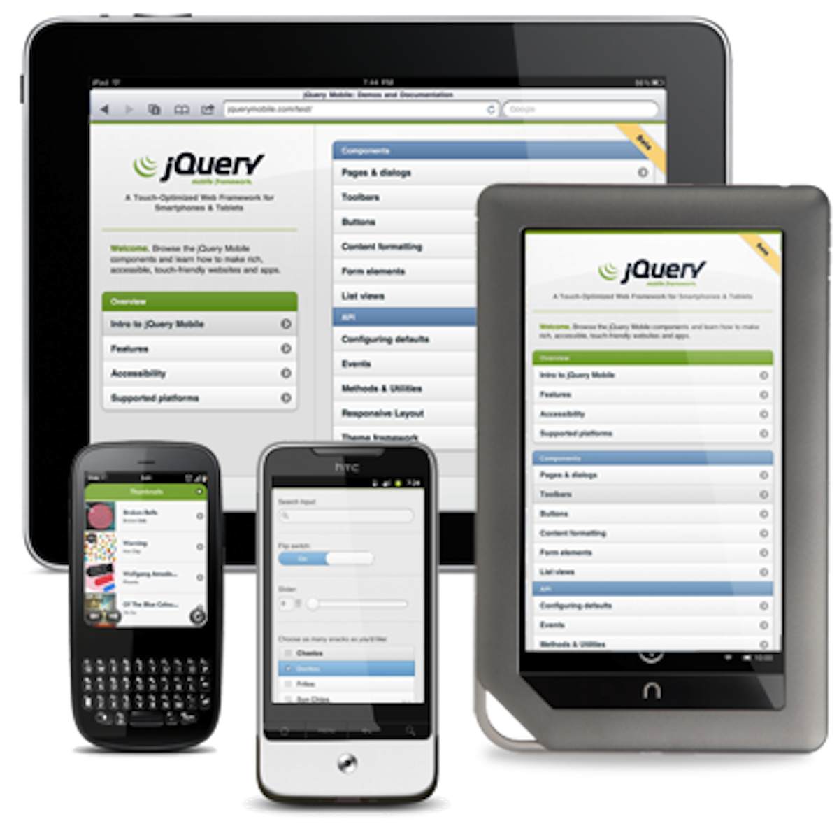
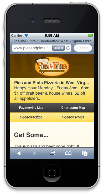
However, the mobile web today is much different from the mobile web of yesteryear thanks to powerful frameworks like jQuery Mobile. With it, you have a write once, run anywhere type of solution for your mobile web. Using your existing CMS, you can tap into the content that you already have and mirror it on your mobile site with a jQuery Mobile enabled minimal theme. This way you don’t have to recreate your content specifically for the mobile web and you can capitalize on the content that you already have.
Because of the power of jQuery Mobile, you also aren’t forced to make a theme for each and every device out there. Hardware fragmentation is an issue that will continue to plague the smartphone world for a while, and as a developer of native apps you have to take those things into consideration when building a native app.
But on the web side you don’t have to worry about that. Build a template that can adapt to various screen sizes with the view port. You can additionally enhance the mobile experience by using various features such as gps or getUserMedia on devices that support it.
Don’t spend all of your time trying to make an individual experience for each type of mobile device. Instead, spend your time and energy making your content accessible to people using mobile devices. Study your analytics and see what content is most popular for people on the go. Push that to the front.
One last thing: don’t forget to provide a handy link to the full version of the site. There are some people who are gluttons for punishment or who just might need something that you don’t provide on the mobile version.
What tips do you have for developing for mobile?


