Back to Basics Series: Leveraging Design Fundamentals for Marketing Success
Explore this post further with AI
In my opinion, one of the most valuable things about visual creativity is that all types of visual media rely on the same foundational principles. Whether you’re designing a logo, creating an illustration, or developing a character, the viewer’s experience should be at the heart of what you make. At Digital Relativity, our expertise in applying core design principles enables us to create impactful, meaningful designs. By focusing on elements like balance, contrast, and alignment, we deepen our understanding of how to shape user experiences. Embracing these fundamentals allows us to channel our creativity with purpose, guiding audiences through our narratives and delivering marketing pieces that make a lasting impression.
The Seven Principles of Design (or thereabouts)
The principles of design may differ depending on who you ask, but they all aim to achieve the same goal: enhancing the viewer’s experience with each element of the design. Each design principle complements the others, and while they may sometimes appear similar, each serves a distinct purpose in creating a captivating and compelling design.
1. Contrast
Contrast refers to the relationship between adjacent elements that highlights their differences. High-contrast elements can be different font weights, for instance, bold vs. light, or different color shades, like warm vs. cool. When objects are in close proximity to each other, creating contrast is the only way to differentiate between the elements because the human eye naturally perceives objects that are adjacent to one another as being related.
Conversely, low-contrast elements can create a sense of connection between otherwise disparate items. By using similar scales, color schemes, or font weights, you can encourage viewers to see two elements as related, even if they don’t share obvious similarities.
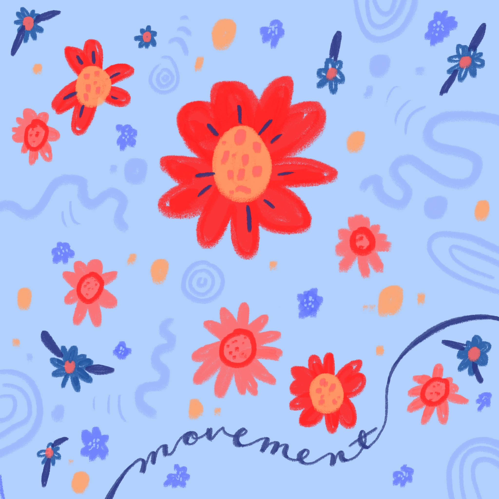
Movement refers to how the human eye navigates a design. Viewers typically focus first on the largest elements, brightest colors, and capital letters, then shift to smaller details, creating a visual flow.
One aspect of movement that we can’t control is the way viewers instinctively interpret visual information based on their reading habits. Every literate viewer brings this bias to a design. For example, English speakers will typically start reading from the upper left corner and move horizontally to the bottom right. In contrast, those who read Tategaki Japanese will begin in the upper right corner and read vertically to the bottom left. This means it’s essential to design with these predispositions in mind, as they influence how your audience engages with the piece.
Establishing a clear direction in your composition is essential for guiding your audience and ensuring they absorb visual information in the intended order. Understanding your audience’s biases — beyond just language — is crucial, as cultural and professional backgrounds can influence how they perceive design elements and colors. By effectively applying design principles, you can either leverage these biases for niche appeal or use them to create a more universally recognizable experience.
By repeating visual elements in different ways and establishing a cohesive theme through color and font choices, you can create a recognizable set of designs that feels unified without appearing identical. Smaller supplementary elements in similar styles contribute to this sense of unity while maintaining viewer interest through their unique differences.
4. Repetition
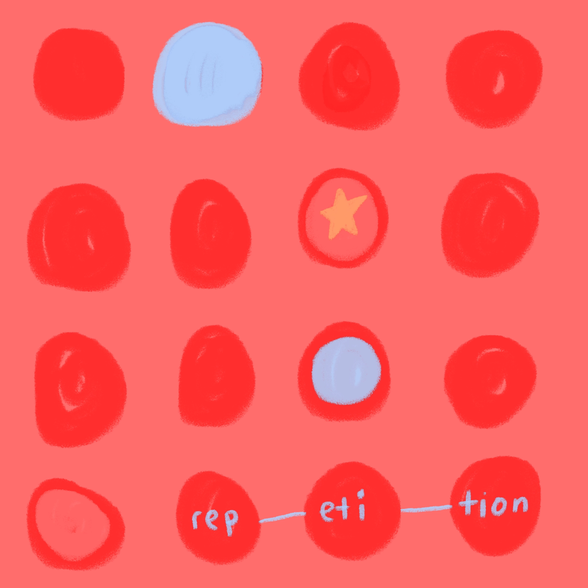
The repetition of visual elements throughout a design not only creates harmony and consistency but also allows the opportunity to break that harmony and capture a viewer’s attention. The repetition of elements can create well-balanced, pleasant designs and compositions. However, when an artist deliberately breaks the expected pattern, it opens up new ways to engage the viewer and guide them through a design. In fact, the human brain is often more attuned to noticing disruptions in a pattern than recognizing the pattern itself.
5. Balance
Balanced compositions create a sense of equilibrium and visual stability. You can incorporate balance in various ways to effectively guide the viewer’s eye. For instance, skewing balance in one direction can create emphasis, while an even distribution fosters comfort for the viewer. Ultimately, your chosen approach should align with the objectives of your finished piece.
One of the key components of balance is negative space. It is important to remember that balance does not have to be achieved by the presence of objects — it can also be achieved in their absence. Intentional negative space use can shape the viewer’s experience and help to properly emphasize parts of a composition.
Like repetition, breaking a rhythmic pattern can effectively draw attention to focal points in a composition. While repetition can occur in colors, sizes, scales, or styles anywhere in a design, rhythm specifically pertains to the spacing between elements and the predictable presence of negative space.
7. Hierarchy
The final principle that brings all design concepts together is hierarchy (and proportion). Hierarchy assigns visual weight to elements, establishing their importance within a composition. It plays a vital role in guiding viewers, particularly in text-heavy designs. A clear text hierarchy ensures that information is read in the intended order. Typically, you should define a header, subheader, body, and accent fonts to represent different levels of importance. Each level should be distinguished by variations in font, weight, and size, allowing you to maintain hierarchy even when using the same font across different formats.
Whether you’re a novice marketer or a seasoned designer, embracing these foundational concepts will empower you to create more impactful and cohesive designs that resonate with your audience. Remember, the art of design is not just about aesthetics; it’s about crafting an experience that captivates and communicates. By intentionally integrating these principles, you can elevate your work and make a lasting impression.

Emma Malinoski
Junior Art Director


