WTF Is Responsive Design Anyway?
Published: September 17, 2013By now, you’ve probably heard your nerdy friends talking about responsive websites at least once. Maybe someone has recommended that you make your site responsive and you have no idea what that means. Or maybe you’ve read my blog post about how to actually start a responsive site, but you’re still lost on what it is and why you need one. I’m here to help.
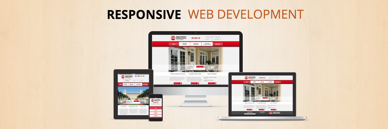
Responsive web design is a way to create a site that eliminates the need to build a completely separate sites just for mobile phones, tablets or any other web-enabled device. You can create a single site that caters to every screen size and resolution.
One major benefit of this is being able to share the same link with someone and not have to worry about what device they are on. For example, I’m reading an awesome blog post on digitalrelativity.com and I want to share it with someone. I can send them the link from my desktop computer in an email or on Facebook, and they can open it on their iPhone, Xbox, PSP, Blackberry, Nexus 7 or even on a 74” TV without worrying if the content will be served in a presentable fashion. It will be. Responsive design allows your site to adjust itself to fit a tiny screen or a giant screen on the fly.
Try It Out
If you’re reading this on a desktop, you can click this link to open a new window that is the same resolution as most smartphones, or just resize this window. Feel free to click and drag to resize the popup window and watch as the site takes the shape of the window.
Some Really Great Examples
There are tons of responsive sites out now. Here is a list of a few good ones:
It’s A Whole New World
If you’re anything like me, you’re going to be resizing every website you come across now. I love seeing how different sites implement responsive design.
Have any ideas of how you will use it?