Responsive Web Design Basics and Keeping Your Site Future-Friendly
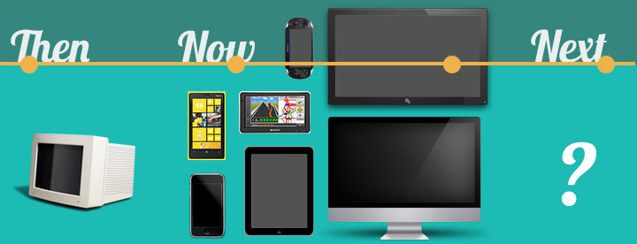
Published: December 12, 2012Responsive Web Design is the newest trend in front-end web development. Making your website responsive eliminates the need for creating a separate website for different devices and resolutions. With all of the different web enabled gadgets out today, the web needs to be more dynamic than ever before. With a responsive website, you can ensure that no matter what device is viewing your site, whether it be mobile phone, gaming console, desktop, tablet, laptop or Smart TV, it will display in a desirable manner.
Responsiveness: Let’s Do This!
So now that we know what Responsive Web Design (RWD for short) is, you may ask, how can I do it?
To really get it, you need to be pretty familiar with CSS. If you are familiar with CSS it isn’t a hard concept to grasp. The only thing you need to learn is how to use Media Queries. Media types have been around for a while, which allow you to specify CSS depending on how you are viewing the content (i.e. Print, Screen, Projection, Handheld are some of the popular ones). But Media Queries were introduced with CSS3, and they provide the benefit of being able to tailor CSS to the targeted device’s screen size. For example, to target a screen that has a width of at least 320 pixels, you would use this query.
   @media only screen and (min-width: 320px) {
	/* Styles here */
   }
Starting Out
A mistake that a lot of people make when starting out with RWD is to have this mindset:
“OK, I have a desktop site, now let’s make this thing responsive!”
A friend of mine that does a ton of Small Business Affordable Web Design Services said he has quite a few clients that really try and build their own site out first, or other’s that hire some fly by night because they were such a good deal that have said that to him and they look at him like he has five heads when he tells them that it doesn’t quite work that way. Responsive design is something that should be thought of before developing the site. If done from the beginning of the development process, implementing responsiveness can be done with relative ease. The thing to keep in mind is that you need to focus on building it mobile first. The problem is that people think that if they had a site built during the great dial up dinosaur days that they should be able to make it responsive.
You want to start out with your basic structure and work your way to higher resolution screens.
The basic structure should just include things like backgrounds, fonts and font colors and your
smallest screen’s structure. The Media Queries should be used to determine sizes of things, like
scaling the size of images as the screens get larger and adjusting elements to fall in beside of one
another as they get more room. Avoid using any sort of fixed-widths in anything but your desktop media query. Here is an example of media queries being used for a layout
/* Site's General Structure  */

	#wrapper{
	 width: 100%;
	 font-family: Arial, sans-serif;
	}

/* Media Queries */

   /* 320px and greater */
   @media only screen and (min-width: 320px) {

   }

   /* 480px and greater */
   @media only screen and (min-width: 480px) {

   }

   /* 768px and greater */
   @media only screen and (min-width: 768px) {

   }

   /* 1024px and greater */
   @media only screen and (min-width: 1024px) {
        #wrapper{
         width: 1024px;
         margin: 0 auto;
        }
   }
As you can see, it’s fairly easy. The #wrapper will be 100% width until it hits the 1024px mark, and it will then break away from the sides and center itself.
Are you keeping your sites future-friendly? Share some responsive design techniques with us in the comments!