
How Font Basics Affect Your Blog Readership
Published: December 27, 2013Okay, so we’re nearing the end of my rant about fixing all the ugly blogs out there. If you’re just now reading, I have been going on and on about your blog’s poor appearance, and how to fix it.
The last blog I wrote was about text alignment. This time I’m going to talk about your font choices.
“Oh no, here we go. A type hipster who named his cat helvetica.”
The name of my cat doesn’t concern you, but the text on your blog should. Type is the most important thing to affect readers on your blog. People in the design world know this as the invisible art. Good type is unseen.Why is this important to you? Keep reading.
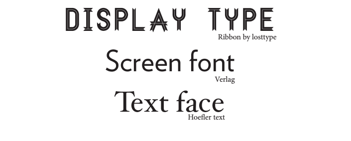
Distinguishing Font Types
There 3 main categories to know: Display, Screen, Text face.
“Okay now that you showed me. Which one do I do I use?”
Selecting the Correct Style
Its not that easy, impatient reader. It actually takes some thinking, and a little bit of research. The first question you should ask yourself (before you just click the helvetica typeface and call your self cool), is: who is your target audience?
Who are you trying to attract?
Is it a match making site? Are you a baker trying to share information about baked goods (if so, send me a link now), or are you a business trying to be presentable? By picking a type that will suit your target audience, you’ll make your readers more comfortable, and give new readers get a feel for what they are about to read.
For example, something more friendly like a bakery site or a life hack site might use a serif font for headers. Serif fonts feel organic, and can make your site feel more at home and less robotic.
For a more buiness-oriented site, a nice header font would be a bold san serif font, showing some personality, but with a business feel.
Always be wary of hand-written fonts. They can be executed nicely, say, for a coffee shop, giving yourself a more personal reader experience. But you have to keep in mind that to the reader, some hand written fonts are not legible.
Display Fonts: Different From Paragraph Fonts
Now, I just wrote mainly about display types. Display type is mainly used for headers, call outs, or something special on the page. Display type should not be a paragraph. Actually, display type shouldn’t even make it to a third line (presuming your headers are h1 tags, and are quite large.)
Screen Fonts: Different From Print Fonts
When you do get into paragraphs, where your content is, its always wise to use a screen font. Screen fonts can get a little confusing for our first-time users, but screen fonts are like helvetica, arial, or verlag. They don’t have serifs like Georgia, Minion or Times new Roman.
For our elder developers, I know those have been defaults for the web for a long time, but a screen font and a text font are completely different, and you should stick to a screen font for content that will be displayed on a screen.
So, hold up, why shouldn’t we use them?
Well, the primary reason is resolution. Screen fonts are made to be set at a resolution of 72 ppi, but text fonts (in books and newspapers) are made to be in a higher quality such as 1000 dpi. So, if you have a type that is made to have crisp, sharp, elegant edges at a quality of 1000, then make it 72, it will make it lose all sense of character.
“Well, joke’s on you blogger man, ’cause Apple has a retina display. You can’t even see the pixels.”
Even though retina was a beautiful thing to happen to typography, it still maxes out at 300 ppi ( much smaller than in print). But by all means, if you want to disobey this blog and use text font, go ahead. But quality comes first for me.
Standing Out Against Competition
And bring originality! This is just a personal kind of issue I have. Nonetheless, something you can think about!
Google Fonts is cool and all. Who doesnt like free fonts? But that’s the thing… WHO doesn’t like free?? Google’s fonts are like your bad sports team giving out a free piece of cloth to everyone to attract people to their game. If everyone has one, it isn’t very special, and doesn’t make you very different.
Being different is more important on the web when your business is up against, I don’t know, the world. Google fonts aren’t going to get you very noticed.
So after bashing Google Fonts, I will say if you do know what your doing with typography and can control your content efficiently, you can make an argument for Google.
It’s okay to reach out to a paid service for your font. Because some guy out there created these fonts for specific reasons, and asking for $2 a month to make you more unique isn’t that bad if it comforts your readers and gets you more business.
Not everything good on the web is free.
What font is on your site?